Lean on me
Syneco knows, understands, and likes its customers—municipal utilities and energy producers—and is so familiar with their workflows that, ultimately, it is people, not processes, that take center stage. That is exactly what needed to be seen and felt. At the same time, the challenge was to move away from safe B2B standards and into a brand presence that feels fresh, customer-centric, and unique, without sacrificing any of its professional authority.
Our job was to put Syneco’s strengths in the spotlight: bundling and automating processes so that customers save time and money, allowing them to return to the tasks that truly matter—with a clear focus on renewable energy.
The industry is rarely bold. So, we decided to be. The new look features an unusually dark aesthetic that clearly stands out from the standard white-and-green palette. It feels premium and modern, and makes the graphic elements stand out particularly well.
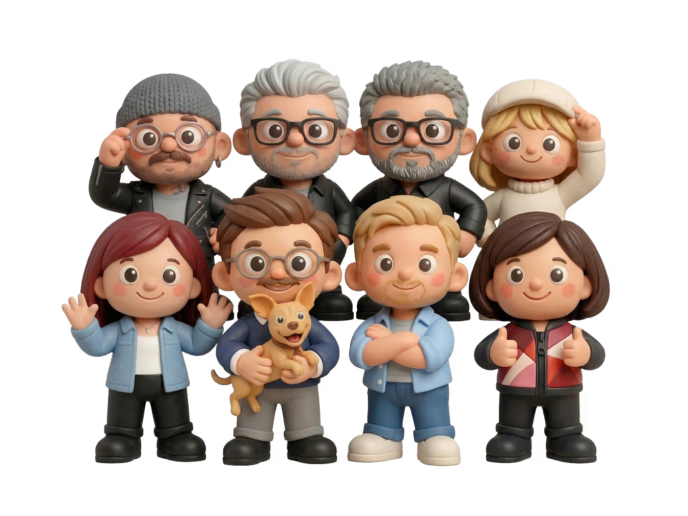
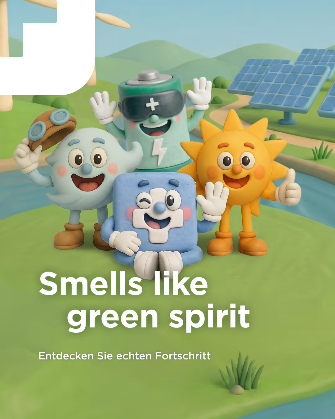
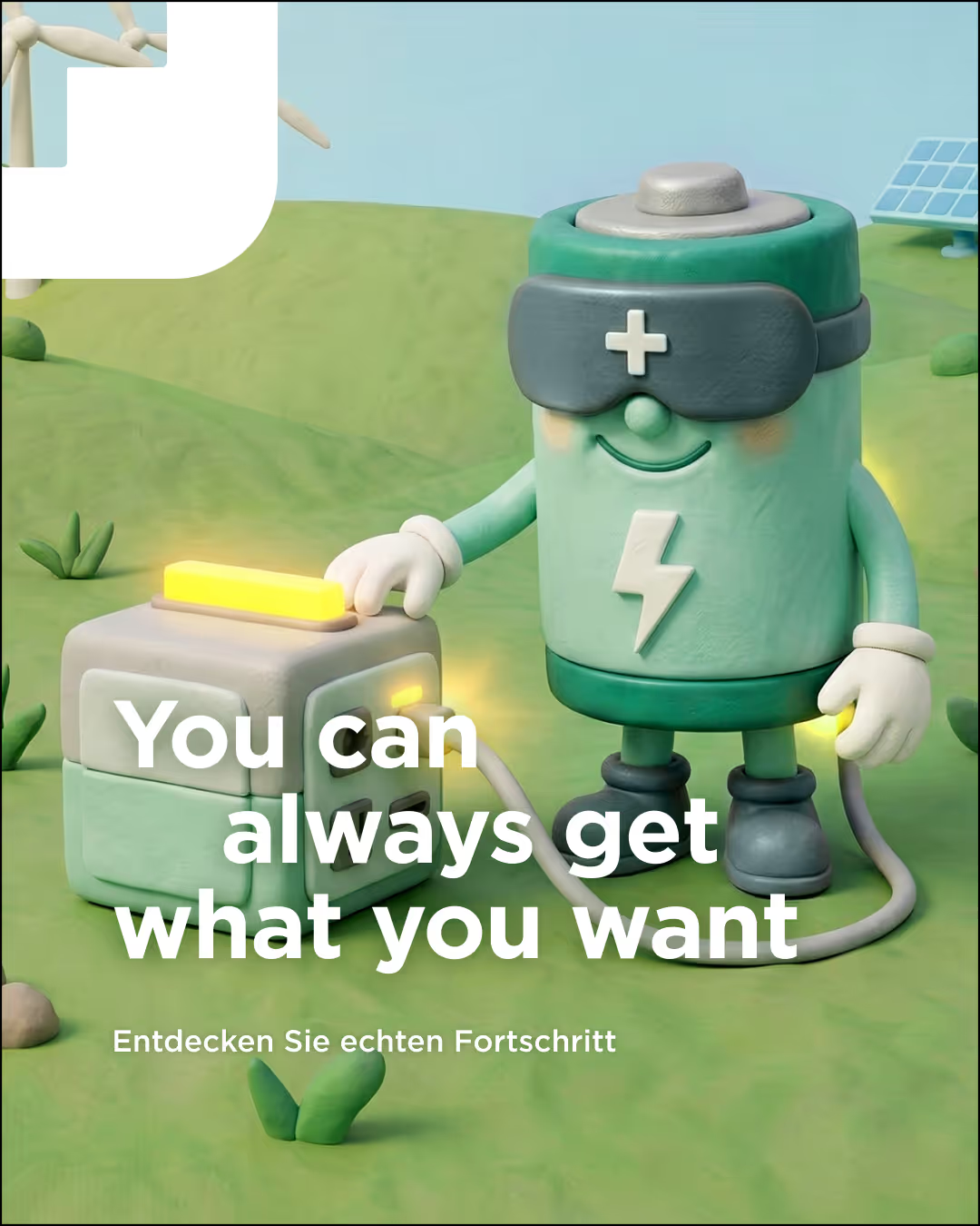
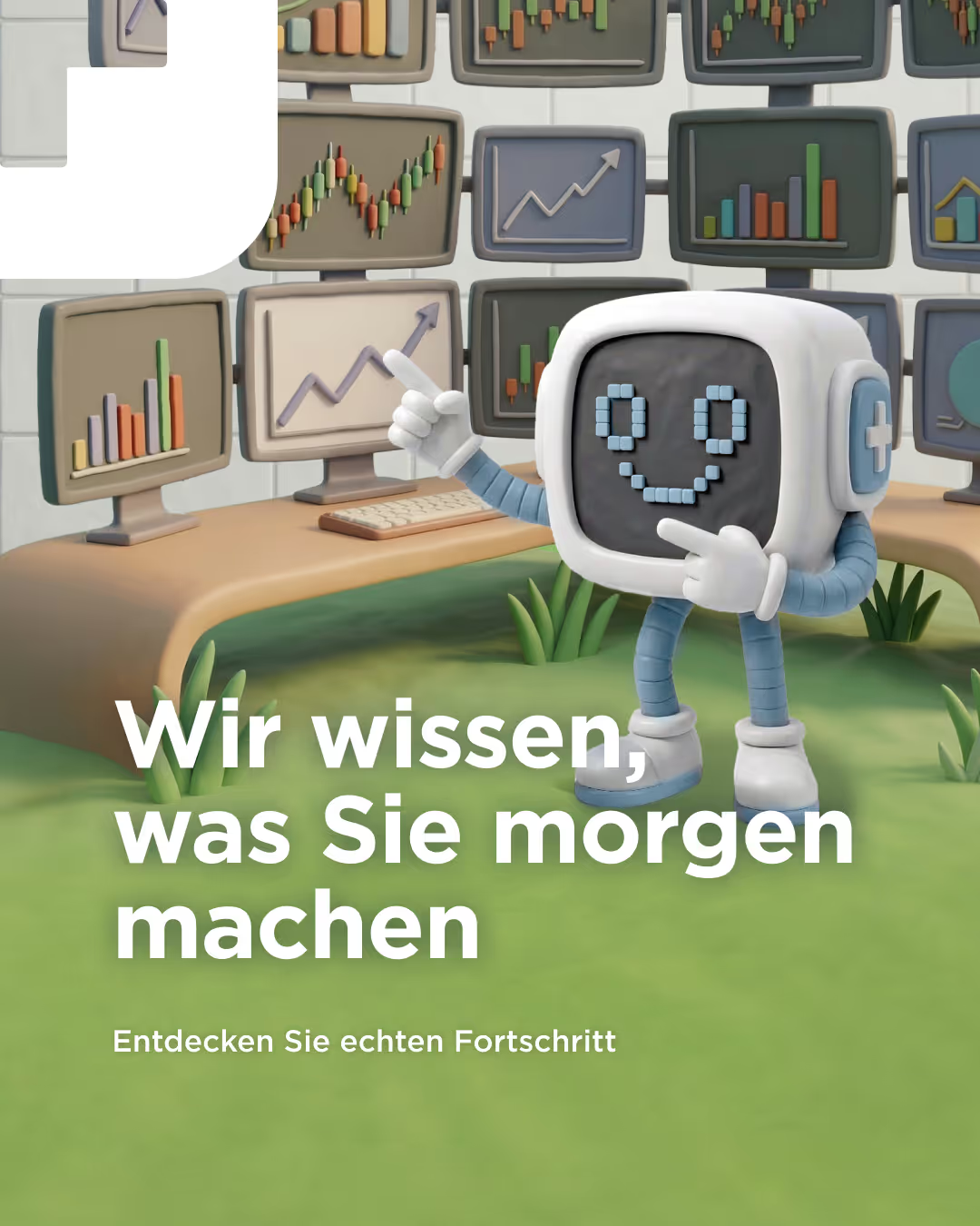
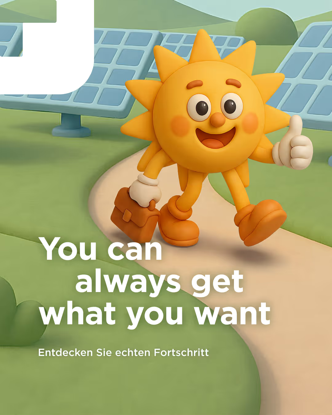
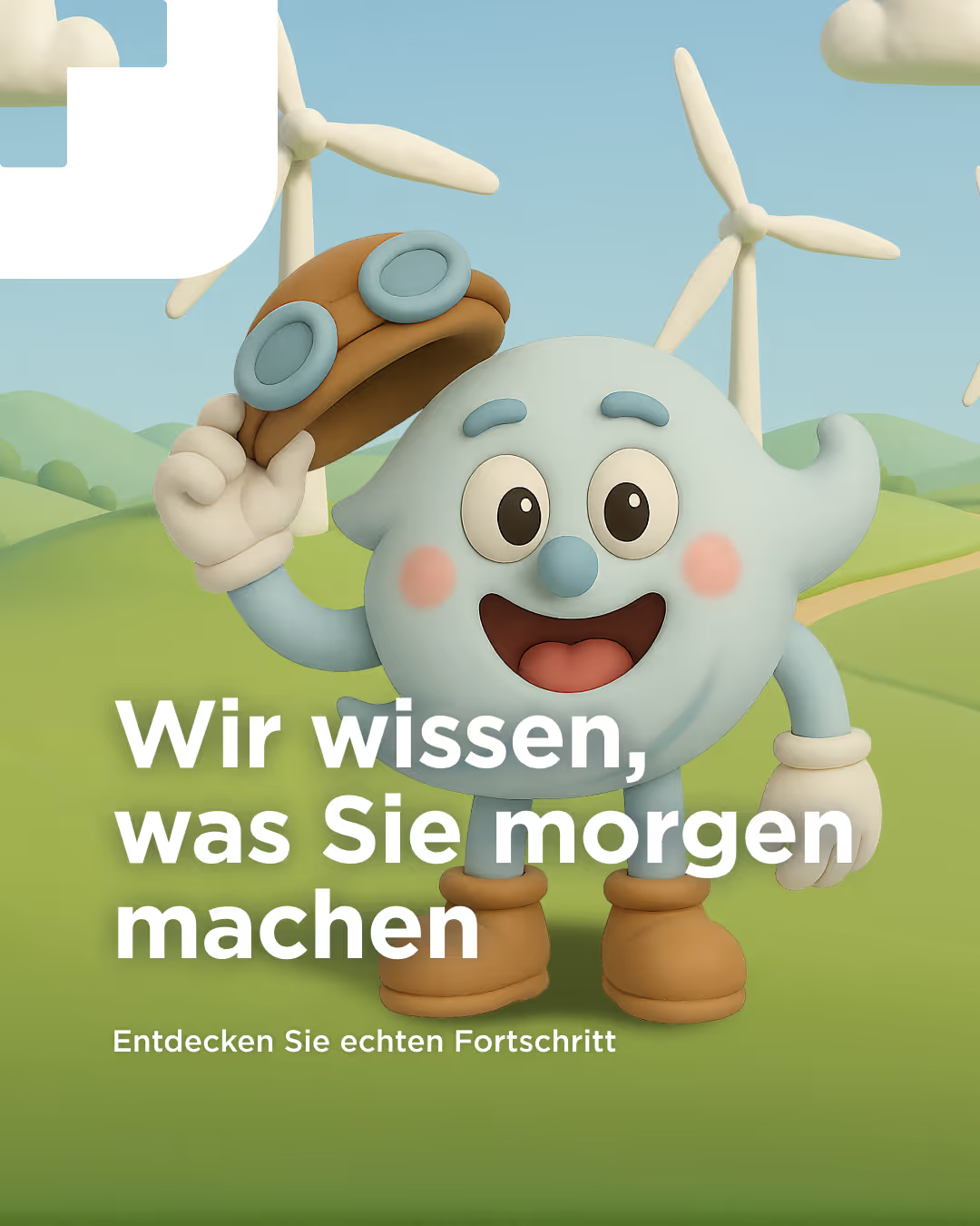
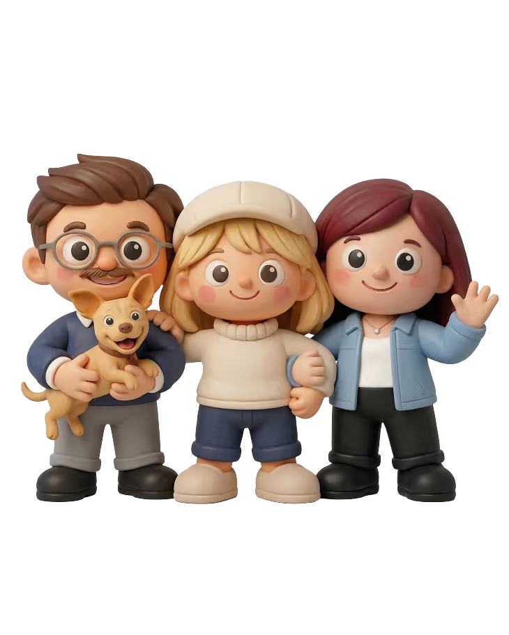
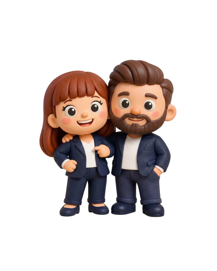
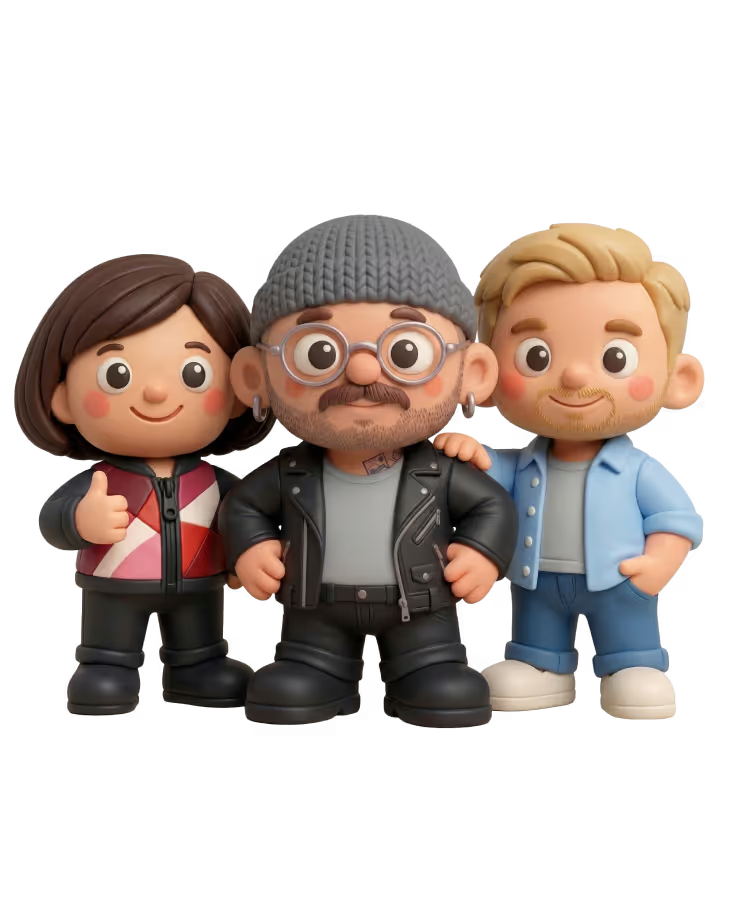
Added to this is the unusual clay aesthetic, which serves as an emotional brand anchor. The clay figures provide warmth and recognition without appearing childish, as they are consistently embedded into the design system. An extensive icon system in the same clay style makes content easier to understand and gives the brand greater visual consistency—even in the long term.
Our strategy began with the concrete solutions Syneco offers its customers, particularly in portfolio management, sales, flexibility marketing, balancing group management, and market access. Through workshops and insights from interviews, we sharpened what Syneco achieves in day-to-day operations: bundling and automating processes to noticeably reduce time and costs.
The creative lever was a campaign motto that sticks. "This is what shared progress sounds like" translates the Syneco mindset into a tone with real earworm potential.
The campaign has made Syneco more visible and unique. A highly competent but rather quiet presence has been transformed into a clear, modern identity that builds rapport while remaining professionally grounded. At its core, it is about genuine, collaborative progress that makes everyday life easier for municipal utilities. Tone, design, and structure work together, the website provides better guidance, and the messages are understood more quickly.
At the same time, we have created a foundation that allows the campaign and the brand to live on in the long term. With mascots, clay figures, and the accompanying system, Syneco’s presence can be continuously brought to life. This keeps the brand relevant without the need for constant reinvention.
Clay-ya!
The clay figures give Syneco a face—or rather, many faces. They bring warmth, humor, and clarity to a complex topic, making renewable energy, smart processes, and system logic tangible. The key is balance: eye-catching but not flashy, emotional but not childish. With matching mini-worlds and motion graphics, this evolved into a consistent universe that is recognizable and easy to build upon.






Click me baby, one more time
The new website was restructured from the ground up, focusing on clear user navigation that addresses the target audience's daily challenges. All solutions and offerings are easy to grasp and logically explained. The dark design intentionally provides a counterpoint, appearing premium and focused, while utilizing the clay aesthetic in a way that stays fresh without feeling overly playful.
You’ve got the look
The campaign world inspired an icon system that does more than just decorate content—it explains it. These clay-style icons provide structure, guidance, and pace, tying the design together across every page. At the same time, they serve as the perfect asset for the post-campaign phase: even when the main visuals fade, the brand’s signature style remains visible and unique.
Rebel yell
The awareness campaign is Syneco’s friendly rebellion against industry routine. It doesn't speak like an energy sector manual, but like a partner who truly knows and values the person they are talking to. That’s why we developed a tone that is approachable and human without sacrificing expertise. Combined with the clay aesthetic, the result is a presence that stands out, builds rapport, and makes one thing immediately clear: Syneco takes the workload off municipal utilities so they have more time for what really matters.
Can you feel it
The new look doesn't just work externally; it also has an impact internally. With custom designs for the office and breakroom, the campaign becomes an experience for employees, fostering identification and strengthening trust. This turns a "new look" into a fresh sense of self and a unique workplace culture.
Give it away now
We made the campaign even more tangible with giveaways like stress balls and clay-style stickers. This brings the Syneco brand to life in the physical world. A small reminder with a big impact: Syneco reduces complexity and relieves stress.
Smooth operators
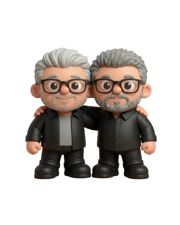
The result of a successful collaboration

Good connections take you further. Here's ours.